Showing posts with label games mechanic. Show all posts

Wednesday, 15 April 2015

Arlo - Final Look


Here are some screenshots of how our final game looks with all the assets and lighting put into Unity. This was certainly an experience and I'm actually very pleased with how it's turned out. We had a few major setbacks towards the end where we lots days of progress due to some file corruption but we discovered what we were doing wrong and managed to fix it in time for the deadline. There are things I would change but nothing that can be in the time we have left. I think the house itself looks good and from myself I am happy with the assets I have produced. All the scripts work and we have a functional project. We worked well together as a team and didn't have any negative engagements. I really enjoyed working on this and would actually like to take it further someday when I have more time and skill to make it the way I envisioned it to be in the concepting phase.

Arlo - Scripts 2


The script for the diary pickup is very long so I split it into 4 parts here. It's using the GUI Style system and took a while to implement. It works by checking for a note on click and running a check for note routine, if reading the note is true which will happen if the mouse is clicked over the object called 'Note', then the GUI will draw the GUI Style onto the screen. The OnGUI shows you which style is going to show up when you click and you set that in the inspector by dragging the style over. The Time.Timescale and mouseLook control whether the player can move or move the camera around whilst reading the note, essentially like a pause. The script is made so when the player clicks it cycles through a series of pictures and then closes when done looking through all of them. 
 Megan created the texture for these note pickups. As you click it starts with the diary page at the back and adds pages on as you click as if you're laying them on top of each other as you look through the diary. 
 Here you can see the diary as it appears in the scene before you pick it up. On the wall is one of a few pictures you can 'pick up' and look at around the house. Sophie made the textures for the child's drawing pictures. The script for this is the same as the one for the diary, only you need to add the section above instead of the note++ bit as you aren't cycling through images but rather picking one up and putting it back down. These two were the hardest of the scripts I had to do and I learnt a lot of scripting stuff doing this. I think for the future I'll learn to use something other than GUI Style as now we have an updated Unity we have access to Canvas. GUI Style is a bit outdated now and also very complicated to use so it will be beneficial to learn something other than GUI Style.

Arlo - Scripts 1

 This is the script that I used to make the bottles smash. We needed to make it so that the bottles would fall apart only when the player controller walked into them. Megan built two separate bottles, one complete one and one that is split into many different polygons. I made it so that when the player enters the collider zone of the bottle the complete one gets switched out for the broken one in the same place. The broken bottle has a box collider and a rigid body on it to make it collapse without falling through the floor.


We have a main menu at the beginning of the game so you can choose to play or exit. The script for this was very simple as it simply involved adding the script to a button and adding a box collider to each button so when it's clicked you load the level selected in the script. The first script there was originally a settings menu and it would allow for the player to go back to the main menu when clicking back. However we decided not to have a settings menu as we have no settings to change and decided to put the instructions on the main page. Sophie drew the instructions and the background is just a screen shot of AJ's room. I made the Arlo heading and the play game and exit buttons.


Mum Rig and Animation


For the model of the Mum, Amber modeled her but I did the rig and this one as well as animating it. This is the first time I've ever rigged anything and I had no idea how or where to start so I looked up a tutorial online to follow. I did switch tutorials halfway through so it got a bit confusing towards the end but I know a bit more for next time and I think I could do a better job then. The easiest bit was definitely drawing the skeleton in and it was ok attaching the various IKs to the model to help it more like a real person. What I found the hardest was after when the skeleton was bound to the model and I needed to paint in the effect of the joints of other parts of the body to make sure there was no warping in the mesh. The tutorial I followed put particular detail into the foot so I may look into doing that again to practice and although it has no used in this project the model is able to go on her tip toes and the balls of her feet as well as move them independently. It is definitely a little bit of a shoddy job but I enjoyed learning this part as since I'm interested in animation it would be bad not to look into the rigging and how the animation can actually work.
 Here you can see how the model bends at the knees and that the IKs are attached between the ankle and the hip.There isn't much warping around the leg area and you can see how the toes bend separately from the feet.
 
 Here is the position the model will stay in during the animations. She was difficult to animate as the rig was a little hard to get used to and use. If I'd had time I think I would have re rigged her with the new knowledge I had of how to rig something. I would like to experiment with rigs in the future and learn how to do it much better. It was a fun part of the project, but I think one of the animations I did didn't export properly and so doesn't look quite right in the games, however there wasn't time to fix it.


Textures

 Although I did a fair bit of modeling I really didn't do that much texturing. It's not one of my strong points although I should probably use that as a reason to practice and get better. I'm very slow at it and it takes me a while to do simple textures. I did texture the dining room table, it was the first thing I've textured in a while and so I'm kind of happy with it. It was difficult trying to reproduce the wood texture as we made most of our own textures ourselves to give a slightly stylised look. I have to learn that although something may not look amazing by itself when texturing I need to look at it as a whole and actually on the model as it may look better than I think.
 Moe originally textured this sofa in plain colours but thought some of the pillows should have patterns on them or I think it would have looked a bit plain. I chose two relatively quick patterns to do so as to not waste time and although it's a small part I think it added to the sofa a bit. We have a red theme for the living room so I tried to stick to red but not so much that it became overwhelming.
This is the texture I think I'm pretty pleased with as I did draw it myself rather than just using a picture and overlaying it.We thought it would be fun to have something on the TV rather than just a black screen. Although I didn't do much texturing I'm happy with the work I did, but I think I can still improve especially with unwrapping and sorting out UV's. I can also improve on my time spent on texturing as I waste a lot of time being so slow at it.

Arlo - Models 3


This is the first of the little bits to put around I made, I used Apple Mac dimensions to model off and used the insert edge loop tool and extrude options to make the keyboard and track pad. It was pretty easy to do and I like how it turned out. 
This was the beginning of a magazine I started making that could have been placed around. I was thinking whether to model more pages or to just texture them in. Either way I ran out of time and didn't manage to finish making it before the game hand in. I do think it could have turned out well though as I do like how it was shaping up. I used the mirror tool so the sides would be even rather than modeling each side differently.

This plant was the first organic thing that I have modeled. Doing a plant was much harder than any object I modeled for this project and I spent a while thinking about how to do it. It does perhaps look a little messy but I like how it looks for my first plant. I'd like to make some more so I can practice foliage as natural modeling is something I've never looked in to. 
This fruit bowl was the last random piece that I made for the house, it was pretty fun although most of the shapes are just spheres. I liked making the bananas and if I'd had time I probably would have put more diverse fruit in it rather than just round ones.

Arlo - Models 2

 These are a desk and chair I modeled for AJ's room. The desk is also used in the bother's room but stretched out a little, and the chair is also used in the basement for the mother to sit on. For the chair I decided to do one of those cheap fold up chairs as I thought it would be interesting to model and would fit better in our scene than a bigger chair, because of the way the room is layed out there isn't much room behind the desk for a chair. The desk was pretty fun to do and I like how the drawers and the handles turned out. The model's geometry is a bit messy but it didn't impact the texturing so it didn't matter so much, but I will aim to make my models much neater in the future to make it easier.
 This is just a simple round table that can be placed around the house to put bits on. It was fun making a round table as all the tables I've modeled so far have been square.
This lamp is the last main piece of furniture I made and I wanted to choose a lamp with an interesting stand. The lamp itself was pretty easy to model but the curved bit around the circle was quite hard as I couldn't find a natural way to do it other than just curve it manually around bit by bit. It was also the hardest bit to unwrap but it turned out ok in the end.

Arlo - Models 1

I made a sofa and a chair for the living room, the chair is just the sofa but shrunk down so I wouldn't have to model it twice and so they looked like they were from the same furniture set. I modeled the base of the sofa first, extruding and stretching out, then modeled the pillows and the feet separately and combined them after I was finished. To make it look rounder I used the smoothing option and converted the smooth mesh to polys. Although it looks nice this gave me a lot of problems when texturing and so I won't rely on it so much in the future to make the models look smooth. I did find though that if the model was unwrapped and textured first and then smoothed the model retained it's UV map and still was able to be smoothed so I might test that out later on. I'm quite pleased with how they look and think my object modeling is getting better. 

 This is a coffee table that is also meant for living room. It's quite simple but does the job and I don't think I'd change it.
 Here is the dining room chair and table I made to go between the living room and the kitchen, at the bottom of the stairs. I wanted them to be simple but still look nice as they will go in the middle of the house and the player has to walk past them quite frequently. I wanted to choose chairs that looked modern but still fit with a lot of the wood items we are planning to have in the house. I'm glad how the table turned out, even though it was simple, I looked up the measurements of a real table and chairs so everything would be in proportion. I'm quite pleased with this set of models and I think they hold up pretty well with the standard of the rest of the house.


Arlo - Concept

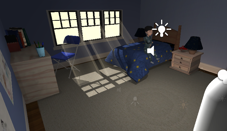
When we originally sat down to brainstorm the game we decided we wanted to do a very story based game. We gathered our inspirations together and Megan made this moodboard with various games and styles we were inspired by. What we came up with was Arlo, a game where you play as a child's imaginary friend, helping him through various trials and protecting him from monsters made from his own imagination. Although it would be in 3D we wanted to keep it styalised and make it pretty colourful, taking inspiration for the monsters from the Babadook film and Madoka show, with the black shadowy outlines of people, hands and animals. After looking into some games we figured we could consider our game a hybrid between Beyond Two Souls and Gone Home, with strong story elements and no ability to fight back. Within this vertical slice we are aiming to make  a small section where you need to go down to the basement where the child's mother has taken the key to his room. You must retrieve this key without waking her and return to the boy and let him out of his room. 

Because the whole game would be based inside the house it was important that we locked down the floor plan before we started putting anything into Unity. I made this floorplan, laying out the space for a 4 person family. The top image is the bottom floor, and the bottom the top floor. The square space to the right of the bottom floor is intended to be the garage but in this slice the player is not supposed to be able to enter that place and we would not be modelling it. Our plan is to model all the large furniture pieces first so as to fill up the house as quickly as we can and then if there's time at the end to model house filler items to make it seem more lived in. 

 We decided we would all come up with concepts and then regroup and pick what we liked from everyone's ideas for the final one. Here are some of my ideas for AJ, the child. It seemed it was something we all agreed on that he would have dark hair as we all drew him like that. My personal favourite from these is the first one as I think the hair looks the best in that one. Sophie was assigned the lead 2D artist and she blocked up the final designs for the mother and the child. 
 Although it was no needed in the end I did some potential concepts for AJ's brother incase we needed to make a design for him if we ever got around to making photo frames.
We all had a go at making kiddy drawings to place around the house, I did this one but forgot about it and so didn't end up doing anything with it for the project. I still like it though and it was fun trying to draw like a 7 year old. 
 These were my ideas for what the mother would look like. I also added a few ideas to her face for perhaps what she would look like in the child's mind. We planned for her to have stages in her transformation as originally we thought there could be a fight against her, however we thought this would be too difficult and so opted out of combat and stages. I liked the idea of her just being a scribbly face as I think it matched her drinking problem and the idea that she's not in her right mind. 
 Instead of having a transformation sequence we thought about having just a monster instead of the mother. These were my ideas for the mother as a monster. I like the idea of her just being a black shape, and because I drew her with blonde hair I thought it would be cool if we could get that to contrast against the black. However this would be too difficult for us to do in the timeframe as we don't know how to animate or model hair to that level yet. I also liked the idea of her being like a ghost without much texture, just being a mat black which I thought would look quite cool. I prefer the first one to the second one but we ended up just having her as a mother rather than having her as a monster. 


Thursday, 11 December 2014

Rain

I attempted to make some rain for the level so as to add some atmosphere to our game slice. It was using the basic particle system on Unity, not using any of the premade water particle prefabs that come with the program.


To make the rain I put in a particle system and had it running at -40 for the start speed so that it would go down rather than up. The emission reate is very high so that the rain falls faster and so seems heavier. Also since the rain is spread over a large area there needs to be a faster emission as it's stretched over more space. The velocity over Lifetime allows the rain to fall downwards for a set time before dissipating so as to not use up excess memory by having it fall all the way through the level. 


To make a splash at the bottom I got a particle system and had it going upwards and by making the gravity multiplier at 2, the particles slightly fall back downwards. Also making the start size very small makes it look a bit more like splashes rather than just the large spheres the default size is. By making the shape a cone as well, you can control the shape that the splashes come up in and the radius so the splash looks more natural. It's also set on collision and placed under the rain system so that they only appear when the rain particles hit the ground. 


This is a close up of what the splashes look like on the ground. I think they look ok here, but when the game is played and the player stands in the rain it looks a bit strange as they come up very close to the player and doesn't look right, and so we decided not to use them in game. 


Here is a snapshot of the rain in my practice unity file. I think it looks pretty good with the splashes but like I said above when the player is inside the rain they look a bit strange and so they did not make the final cut. 


This is what the rain looks like in the game. I quite like how it turned out since I haven't used particle systems before and it was interesting to play around with the settings and make the final product. I'd like to explore particle systems more and look at the premade ones and practice making my own, including entering an own made particle image and seeing how it affects the look of different particle systems.